
Discover more from Content Workshop
Letter #55: How to be vulnerable in product-led content
You aren’t perfect and your readers know that
Know when readers stop trusting you? When you tell them your tool is perrrfect for them.
But is it? If you go on a human-to-human level for a bit (yes, I’m suggesting you think outside the B2B realm), you’ll recall our primitive brains don’t trust anybody so easily.
If anything, making big claims about your tool solving all their problems triggers their “what’s the catch” alarm.
The result? They hop off your page 😬 If they’re in the discovery stage, they won’t return. And if they’re in their interested-buyer stage, they’d head off to review sites and google “you vs. your arch competitor.”
If you really want to win loyal users though, the solution is a simple one: be vulnerable.
Here’s how:
1. Tell your readers exactly who you aren’t for
But wait, isn’t this the recipe for sending away potential customers?
Nope, it’s the recipe for attracting the right ones — the ones who won’t churn the very next day.
Most of all, clarifying who you aren’t for is going to be your word-of-mouth generator for exactly who you are. Meaning: more users, ultimately.
2. Create brutally honest tool comparison pieces
Comparison content is excellent middle-of-the-funnel (MOFU) content that’s also relatively easy to rank for.
The key to actually moving interested leads to the next stage in their buyer’s journey: be honest.
Tell your readers what your tool A is good for, what its shortcomings are, and who exactly it’s for.
Don’t have a mobile app but tool B (your competitor) has, for example? Own it. Tell your reader you don’t have one so if they’re using a mobile device mostly, you’re likely not a good fit for them.
Hiding this fact won’t make it go away. And readers aren’t fools. They’ll do their research anyway and find out you don’t have that one feature they’re looking for. So why play pretend for short-term wins 🫣
3. Tell them how you’re better than the others if that’s the claim you’re making
Better isn’t a differentiator. But if you really are better then be smart about showing exactly how you’re different.
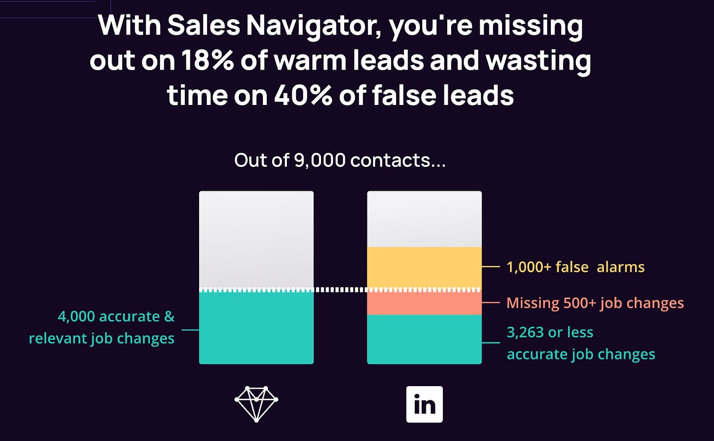
UserGems, for example, cites research to create a comparative chart between their tool and LinkedIn Sales Navigator. See for yourself:
4. Remove friction from learning
Showing your tool work in action is always a winner. I can’t tell how many times I’ve tried a tool just because it’s easy to use — something I believed in only after seeing how things are done in action.
But if you’re assuming readers would come to you like bees rushing to the nearest source of honey, think again. They’d never ask for a demo unless they are very interested.
Your job then is to make learning easy by showing your product in action in the following ways:
Create and share GIFs in your content to show how to accomplish one action (at a time) in your tool
Create a screen-recorded demo showing what exactly your product does (remember to avoid feature overload — talk about 1-2 things at most and don’t gate the video)
Host webinars to share use cases about your product (feature your users here to mix in social proof in the picture — Miro does this best)
5. Prey on competitors’ weaknesses but only when you have proof
Badmouthing others only leaves a bad impression on your readers.
If you’re comparing or sharing alternatives (another type of useful MOFU content), talk logic.
Here’s Apollo doing this brilliantly:
That’s all for the week, fellas.
See you next Tuesday,
Masooma
Subscribe to Content Workshop
Weekly emails unearthing the stuff that ridiculously good product-led content is made of ✨


Nice article. A different way of approaching the audience. Always good to have a change in perspective.